Creating stunning social media graphics can make a huge difference in how people see and interact with your brand online. Whether you’re posting on Instagram, Facebook, or Pinterest, eye-catching visuals grab attention and encourage people to stop scrolling. But what makes a graphic truly stand out? Let’s dive into the best practices for designing social media graphics that people can’t help but notice.
####Understanding Your Audience
Before you even start designing, it’s important to know who you’re creating for. Think about your audience’s age, interests, and what they like to see online. For example, if your followers are mostly young adults, bright and trendy colors might work well. If you’re targeting professionals, a clean and simple look could be better. Knowing your audience helps you choose the right style, colors, and messages that will connect with them.
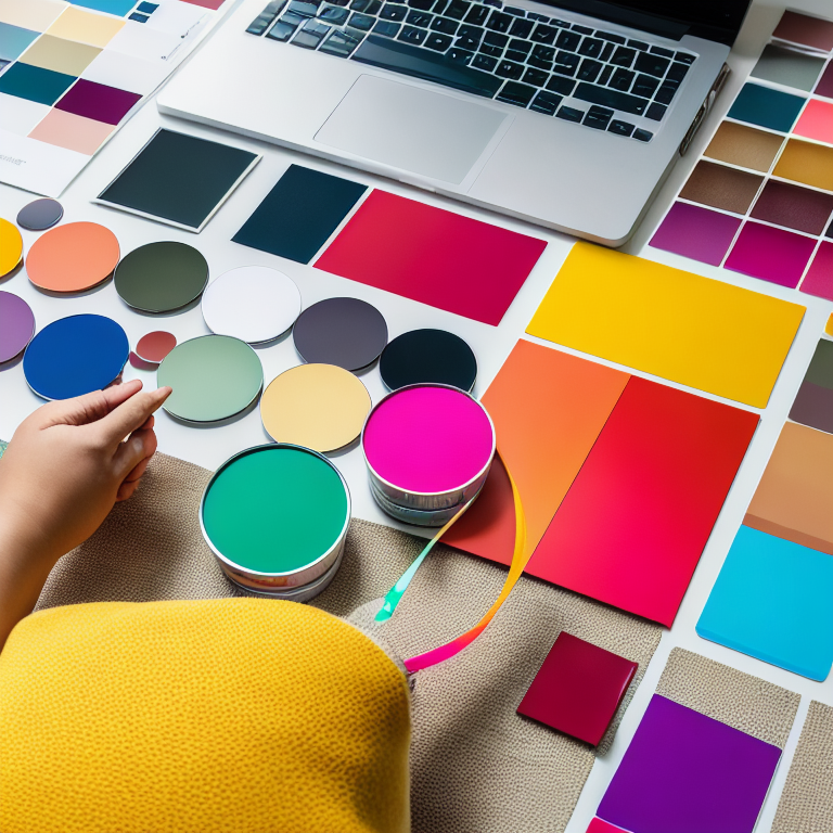
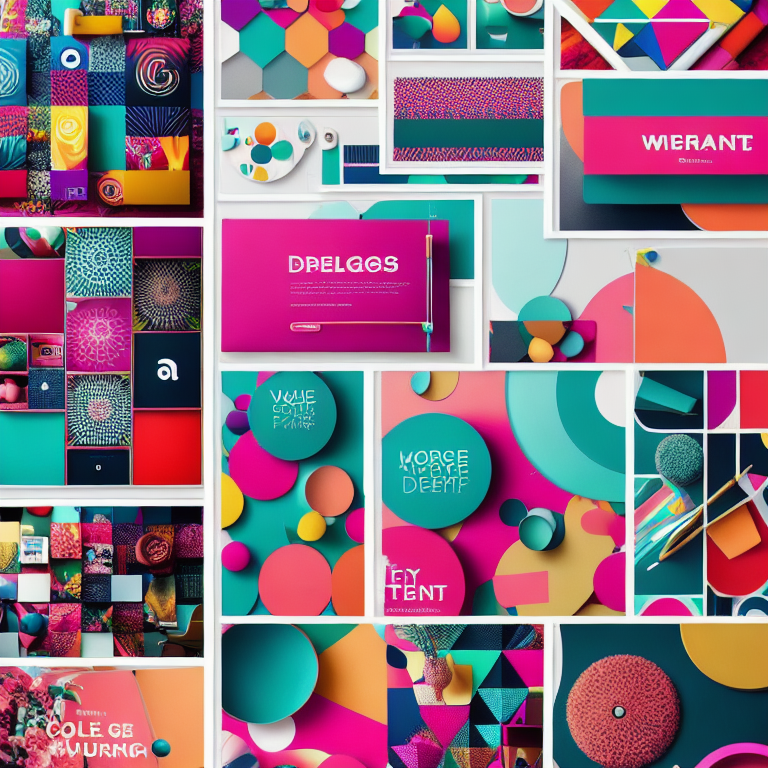
####Choosing the Right Colors
Color is one of the first things people notice in a graphic. Using the right color palette can make your design pop and feel more professional. Stick to a few main colors that match your brand. If you’re not sure where to start, check out helpful guides like “How to Choose the Perfect Color Palette for Your Brand: A Simple Guide” for ideas. Remember, colors can also affect how people feel—warm colors like red and orange can feel energetic, while blues and greens are calming.
####Using Clear and Simple Fonts
The text in your graphic should be easy to read, even on a small phone screen. Choose fonts that are clear and not too fancy. Avoid using too many different fonts in one graphic—two at most is a good rule. Make sure the text color stands out against the background so people don’t have to squint to read it. If you’re ever unsure about font choices, take a look at tips for designing Pinterest pins, where readability is super important.
####Keeping It Simple and Focused
Sometimes, less is more. A cluttered graphic can confuse people and make it hard for them to understand your message. Focus on one main idea or call to action. Use plenty of white space (empty areas) to give your design room to breathe. This makes your graphic look clean and professional, and it helps your main message stand out.
####Using High-Quality Images
Blurry or pixelated images can make your graphic look unprofessional. Always use high-quality photos or illustrations. If you’re using your own photos, make sure they’re well-lit and in focus. If you need free images, there are many websites that offer high-quality stock photos. For creating your own art, you might want to explore free digital art tools to make unique graphics that fit your style.
####Adding Your Brand Elements
Your social media graphics should feel like they belong to your brand. This means using your logo, brand colors, and even your brand’s tone of voice in the text. When people see your graphics, they should instantly recognize who made them. This builds trust and helps your brand stand out.
####Optimizing for Each Platform
Every social media platform has its own best practices for image sizes and styles. For example, Instagram Stories are vertical, while Facebook posts are more square. Make sure your graphics are the right size for each platform so they look their best. If you’re making Instagram Stories, check out guides like “How to Create Stunning Instagram Stories with Canva: A Step-by-Step Guide” for tips on getting the size and style just right.
####Using Templates for Consistency
If you’re posting often, using templates can save you time and keep your designs consistent. Many tools, like Canva, offer free templates that you can customize with your own colors and text. This way, your graphics will always look professional and on-brand, even if you’re not a design expert.
####Testing and Improving Your Designs
After you post your graphics, pay attention to how people respond. Which ones get the most likes, comments, or shares? Use this information to improve your future designs. Sometimes, small changes—like adjusting the font size or changing the background color—can make a big difference.
####Adding Fun and Personality
Social media is all about being fun and relatable. Don’t be afraid to add a little humor or personality to your graphics. Use playful illustrations, fun icons, or even memes if they fit your brand. People love to share things that make them smile, so adding a personal touch can help your graphics spread even further.
####Making Graphics Accessible
It’s important to make sure everyone can enjoy your graphics, including people with vision impairments. Use high-contrast colors so text is easy to read, and add alt text to describe your images. This helps people using screen readers understand what’s in your graphic. Making your designs accessible shows you care about all your followers.
####Staying Up-to-Date with Trends
Social media trends change quickly, and it’s good to keep an eye on what’s popular. This doesn’t mean you have to follow every trend, but sometimes adding a trendy element can make your graphics feel fresh and relevant. Just be sure it fits with your brand and doesn’t distract from your main message.
####Frequently Asked Questions (FAQ)
What are the best tools for making social media graphics?
There are many great tools, like Canva, Adobe Spark, and free digital art tools. These make it easy to create professional-looking graphics, even if you’re not a designer.
How do I choose the right colors for my graphics?
Start with your brand colors, and use a color palette tool if you need ideas. Make sure your colors look good together and are easy to read.
What size should my social media graphics be?
Each platform has its own recommended sizes. For example, Instagram posts are usually square, while Stories are vertical. Always check the latest guidelines for each platform.
How can I make my graphics more engaging?
Use clear, bold text, high-quality images, and a simple design. Add a call to action, like asking people to like or share your post.
Why is it important to keep my graphics consistent?
Consistency helps people recognize your brand quickly. Using the same colors, fonts, and style makes your posts feel connected and professional.
Can I use free images in my graphics?
Yes! There are many websites that offer free, high-quality images. Just make sure to check the license so you know how you can use them.
####Conclusion
Designing eye-catching social media graphics doesn’t have to be hard. By understanding your audience, using the right colors and fonts, keeping your designs simple, and staying consistent with your brand, you can create visuals that people love to see and share. Remember to always use high-quality images, optimize for each platform, and keep your designs accessible to everyone. With a little practice and creativity, your social media graphics will stand out and help your brand shine online.


Leave a Reply