Do you ever look at professional designs and wonder how they make everything look so polished and eye-catching? Graphic design might seem intimidating at first, but improving your skills is actually easier than you think. Whether you’re creating social media posts, designing a logo, or working on a personal project, there are simple techniques that can instantly elevate your work.
The best part? You don’t need expensive software or years of experience to get started. With a few basic principles and some practice, you can create designs that look professional and communicate your message effectively. Let’s explore some practical ways to boost your graphic design abilities right away.
Understanding Basic Design Principles
Before diving into specific tools or techniques, it’s important to understand the fundamental principles that make designs work. These aren’t complicated rules – they’re more like guidelines that help create visual harmony.
Balance is one of the first principles to master. Every design has visual weight, and good designs distribute this weight evenly across the space. Think of it like arranging furniture in a room – you wouldn’t put all the heavy pieces on one side. Similarly, in design, you want to balance large elements with smaller ones, or dark colors with light ones.
Contrast helps certain elements stand out. This could mean using different colors, sizes, or shapes to create visual interest. Without contrast, everything blends together and nothing catches the eye. A simple way to think about contrast is to imagine a black text on a white background – the difference makes the text readable.
Alignment creates order and organization. When elements line up with each other, whether left, right, center, or along a grid, it creates a sense of structure. Even designs that look casual or creative usually have some underlying alignment that keeps everything cohesive.
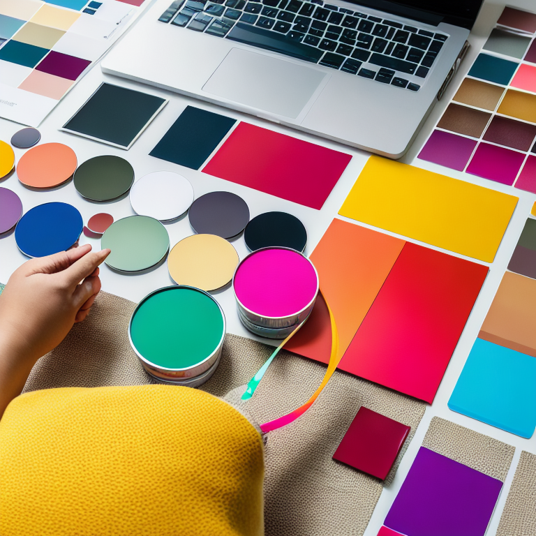
Choosing the Right Color Palette
Color can make or break a design. The right colors evoke emotions, create brand recognition, and guide the viewer’s attention. But choosing colors doesn’t have to be overwhelming.
Start with color theory basics. Complementary colors sit opposite each other on the color wheel and create vibrant contrast. Analogous colors sit next to each other and create harmony. Monochromatic schemes use different shades of the same color for a sophisticated look.
When selecting colors for your project, consider your purpose. Are you designing for a business? Look at color psychology – blue often conveys trust and professionalism, while green suggests growth and health. For personal projects, think about the mood you want to create.
A simple trick is to use the 60-30-10 rule: 60% of your design in a dominant color, 30% in a secondary color, and 10% in an accent color. This creates balance without being overwhelming. You can find inspiration for color palettes in nature, art, or even your favorite websites.
Mastering Typography
Typography is more than just picking a pretty font. It’s about making text readable and ensuring it communicates effectively. Good typography can transform a design from amateur to professional.
Start with font pairing. Using too many different fonts creates visual chaos. A good rule is to stick with two or three fonts maximum – perhaps one for headings and another for body text. When pairing fonts, try combining a serif font (with little feet on the letters) with a sans-serif font (without feet) for contrast.
Size and spacing matter tremendously. Text that’s too small becomes unreadable, while text that’s too large can overwhelm other elements. Pay attention to line height (the space between lines of text) and letter spacing. Generally, increasing line height slightly improves readability, especially for longer paragraphs.
Hierarchy guides the viewer’s eye. Use different font sizes, weights, or colors to show what’s most important. Your main headline should be the largest and boldest, followed by subheadings, then body text. This creates a clear path for readers to follow.
Using White Space Effectively
White space (also called negative space) is the empty area around design elements. It might seem like wasted space, but it’s actually one of the most powerful tools in design.
White space gives your design room to breathe. When elements are crammed together, nothing stands out and the design feels cluttered. By adding space around important elements, you draw attention to them and make the overall design feel more organized.
Think about luxury brands – they often use plenty of white space to create a feeling of elegance and simplicity. Even if you’re not going for a luxury look, white space helps create balance and improves readability.
Don’t be afraid of empty areas in your design. Sometimes the best solution is to remove elements rather than add more. A simple design with thoughtful white space often communicates more effectively than a busy one.
Learning Basic Layout Techniques
Layout is how you arrange all the elements in your design – text, images, shapes, and other components. A good layout guides the viewer’s eye and creates a logical flow of information.
The rule of thirds is a classic layout technique. Imagine dividing your design into a 3×3 grid. Placing important elements along these lines or at their intersections creates natural focal points. This technique is why you often see subjects placed off-center in photographs and designs.
Grids provide structure for your layout. Even if you don’t see the grid lines in the final design, using a grid helps align elements consistently. Many design programs have built-in grid systems you can use as a guide.
Consider the visual path you want viewers to follow. Where should they look first? What information should they see next? Arrange your elements to create a natural reading flow, whether that’s left to right, top to bottom, or in a specific pattern for your design.
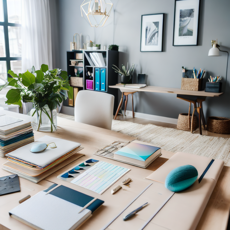
Practicing with the Right Tools
You don’t need expensive software to create great designs. There are many free and affordable tools that offer professional features.
Canva is an excellent starting point for beginners. It offers templates for almost everything – social media posts, presentations, posters, and more. The drag-and-drop interface makes it easy to experiment with layouts and elements. You can start with a template and customize it to fit your needs. For more detailed guidance, check out our article on how to use Canva for professional-looking designs.
For those wanting more control, free tools like GIMP (for photo editing) and Inkscape (for vector graphics) offer powerful features without the cost. Many online platforms also provide free design elements like icons, illustrations, and stock photos.
The key is to practice regularly. Try recreating designs you admire, experimenting with different layouts, or challenging yourself to create something new each week. The more you work with design tools, the more comfortable you’ll become.
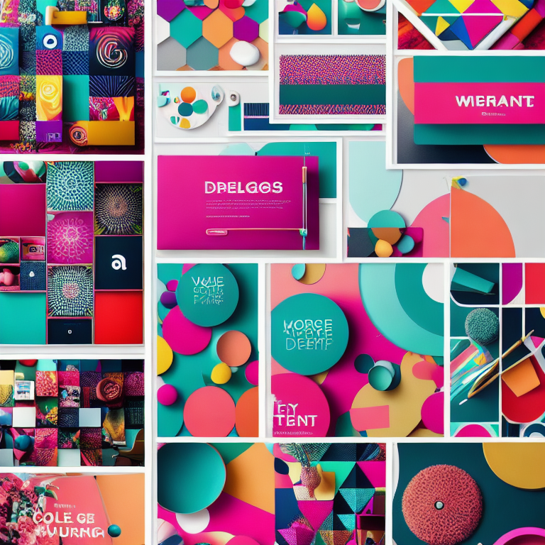
Creating Consistent Branding
If you’re designing for yourself or a business, consistency is crucial. Consistent design builds recognition and trust. This means using the same colors, fonts, and style across all your materials.
Start by defining your brand elements. Choose 2-3 main colors and 1-2 fonts that represent your style or business personality. Create simple guidelines for how to use these elements – for example, always using your main color for headlines and your secondary color for accents.
Templates can help maintain consistency. Create master templates for common design needs like social media posts, business cards, or presentations. This ensures you’re using the same layout and brand elements every time.
Think about your audience too. Different platforms and audiences might require slight adjustments to your design approach. What works on Instagram might need modification for LinkedIn or print materials.
Getting Feedback and Learning Continuously
One of the best ways to improve your design skills is to get feedback from others. Sometimes we’re too close to our work to see what could be improved.
Share your designs with friends, colleagues, or online communities. Ask specific questions like “Does this feel balanced?” or “Is the text readable?” rather than general “What do you think?” questions. This helps you get actionable feedback.
Study designs you admire. What makes them effective? Is it the color choices, the layout, or the way they use typography? Try to identify specific techniques you can apply to your own work.
Follow design blogs, watch tutorials, and stay curious about new trends and techniques. Design is always evolving, and there’s always something new to learn. The key is to keep practicing and experimenting.
Frequently Asked Questions
What’s the easiest way to start learning graphic design?
Start with free tools like Canva and focus on one principle at a time. Try recreating simple designs you like, and practice consistently. Don’t worry about perfection – focus on learning and improving gradually.
Do I need to know how to draw to be good at graphic design?
No, drawing skills aren’t necessary for most graphic design work. Many successful designers can’t draw well but excel at layout, typography, and using design software. Design is more about visual communication than artistic drawing ability.
How long does it take to become good at graphic design?
It depends on how much time you dedicate to practice. With consistent effort, you can create decent designs within a few months. Becoming proficient typically takes 6-12 months of regular practice, while mastery can take years. The key is to keep learning and creating.
What’s the most common mistake beginners make in graphic design?
Overcrowding designs is probably the most common mistake. Beginners often try to include too many elements, colors, or fonts. Remember that sometimes less is more. White space and simplicity often create stronger, more professional-looking designs.
Should I follow design trends or create my own style?
Start by learning established design principles and studying current trends. As you gain confidence, you can develop your own style. Many successful designers blend trendy elements with their unique approach. The key is understanding the rules before you decide to break them.
Conclusion
Improving your graphic design skills doesn’t require expensive software or years of formal training. By understanding basic principles like balance, contrast, and hierarchy, you can create designs that look professional and communicate effectively. Start with simple tools, practice regularly, and don’t be afraid to experiment.
Remember that every designer started somewhere. The most important thing is to keep creating, learning from feedback, and refining your approach. Whether you’re designing for fun, building a business, or exploring a new career path, these foundational skills will serve you well.
Take what you’ve learned and apply it to your next project. Try using a new color palette, experiment with white space, or practice your typography skills. With each design you create, you’ll notice improvement and develop your unique creative voice. The world of graphic design is waiting for you to make your mark.


Leave a Reply