Blog

  • How to Create Stunning Digital Art with Free Tools

    How to Create Stunning Digital Art with Free Tools

    Creating beautiful digital art doesn’t require expensive software or fancy equipment. Thanks to the many free tools available today, anyone can start making stunning artwork right away. Whether you’re just starting out or want to improve your digital art skills, these free programs offer professional-quality features that rival paid alternatives.

    The best part about digital art is that you can experiment without worrying about wasting materials. Made a mistake? No problem – just hit undo. Want to try a different color scheme? Easy to change. This freedom to explore and create without limits is what makes digital art so exciting and accessible to everyone.

    Essential Free Digital Art Software

    The foundation of any digital art journey is finding the right software. Several excellent free programs can handle everything from simple sketches to complex paintings.

    Krita is one of the most popular free art programs, offering hundreds of brushes, layer support, and animation tools. It works great for both beginners and professionals, with an interface that’s easy to learn but powerful enough for serious projects.

    GIMP is another fantastic option, especially if you want photo editing capabilities along with digital painting tools. It handles layers, filters, and effects beautifully, making it perfect for creating mixed media artwork.

    MediBang Paint is ideal for comic artists and illustrators, with built-in comic templates, cloud storage, and a clean, simple interface that’s perfect for quick sketches and detailed illustrations.

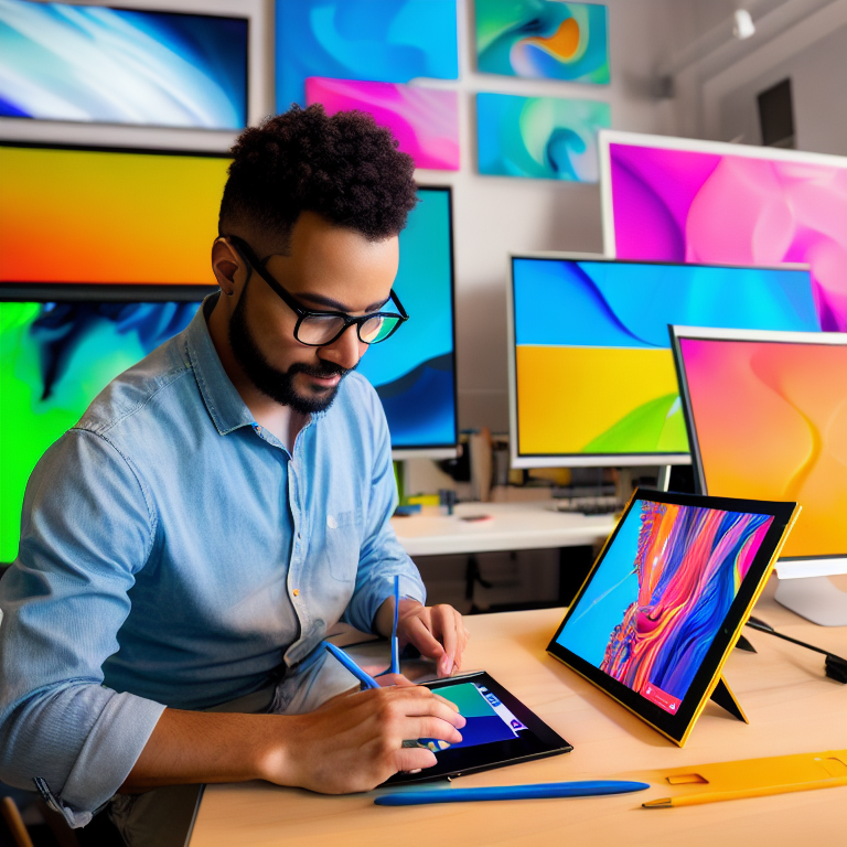
    Setting Up Your Digital Workspace

    Before you start creating, you’ll want to set up your workspace for maximum creativity and comfort. Even with free tools, having the right setup makes a huge difference.

    A drawing tablet is the most common tool for digital art, but you don’t need an expensive one. Many artists start with basic graphics tablets that connect to your computer via USB. If you don’t have a tablet, you can still create amazing art using a mouse or even your finger on a touchscreen device.

    Make sure your workspace has good lighting to reduce eye strain, and consider using a color-calibrated monitor if possible. This helps ensure the colors you see on screen match what you intend to create.

    Understanding Basic Digital Art Techniques

    Digital art has some unique techniques that differ from traditional drawing and painting. Learning these basics will help you create better artwork faster.

    Layers are one of the most powerful features in digital art. Think of them like transparent sheets stacked on top of each other. You can draw on separate layers for the background, characters, and details, making it easy to edit specific parts without affecting others.

    Brush settings are another important concept. Most free art programs let you adjust brush size, opacity, flow, and texture. Experimenting with these settings helps you achieve different effects, from soft watercolor-like strokes to sharp, detailed lines.

    Selection tools let you isolate parts of your artwork for editing, moving, or applying effects. Learning to use the lasso, magic wand, and other selection tools will speed up your workflow significantly.

    Finding Inspiration and Building Your Style

    Every artist needs inspiration, and the digital world offers endless sources. Social media platforms like Instagram and Pinterest are filled with amazing artwork you can study and learn from.

    Start by collecting references – photos, paintings, or other artwork that inspire you. Many free art programs include built-in browser windows or allow you to keep reference images open alongside your workspace.

    Don’t worry about copying other artists’ styles exactly. Instead, study what you like about their work and incorporate those elements into your own unique style. Over time, you’ll develop a personal artistic voice that’s distinctly yours.

    Free Resources for Digital Artists

    Beyond the software itself, many free resources can enhance your digital art journey. Brush packs are available for most free programs, offering specialized tools for different styles like manga, oil painting, or pixel art.

    Color palettes and swatches can be downloaded for free, helping you choose harmonious color combinations without the guesswork. Many artists share their custom palettes online, organized by theme or mood.

    Tutorial websites and YouTube channels offer countless free lessons on everything from basic techniques to advanced effects. Sites like Draw with Jazza, Proko, and Ctrl+Paint have excellent free content for artists at all levels.

    Common Digital Art Mistakes to Avoid

    When starting out, it’s easy to make mistakes that can slow your progress or frustrate you. Being aware of these common pitfalls helps you avoid them.

    One mistake is trying to use too many fancy brushes or effects before mastering the basics. Start with simple brushes and focus on fundamentals like composition, lighting, and anatomy before getting into complex techniques.

    Another common error is working at too low a resolution. Always create your artwork at a high enough resolution (at least 300 DPI) so you can print it later if desired. Low-resolution art looks blurry and unprofessional.

    Many beginners also struggle with color management. Make sure your monitor is set to a standard color profile, and learn basic color theory to create more appealing artwork.

    Taking Your Art to the Next Level

    Once you’re comfortable with the basics, there are several ways to improve your digital art skills. Regular practice is essential – try to create something every day, even if it’s just a quick sketch.

    Study traditional art fundamentals like perspective, anatomy, and composition. These principles apply to digital art just as much as traditional media, and understanding them will dramatically improve your work.

    Join online art communities where you can share your work, get feedback, and connect with other artists. Many free art programs have active communities that share tips, resources, and encouragement.

    Frequently Asked Questions (FAQ)

    What’s the best free software for beginners in digital art?
    Krita is often recommended for beginners because it has an intuitive interface while still offering powerful features. It’s free, regularly updated, and has a large community of users who share tutorials and resources.

    Can I make professional-quality art with free tools?
    Absolutely! Many professional artists use free software like Krita and GIMP. The quality of your art depends more on your skills and creativity than the cost of your tools. Several successful illustrators and concept artists create their work entirely with free programs.

    Do I need a drawing tablet to create digital art?
    While a drawing tablet makes the process more natural and precise, it’s not required. Many artists create beautiful digital art using only a mouse or even touchscreens. If you’re just starting out, try creating with what you have before investing in equipment.

    How can I learn digital art techniques for free?
    YouTube has countless free tutorials covering every aspect of digital art. Many professional artists also offer free courses on their websites or social media platforms. Practice consistently and don’t be afraid to experiment with different techniques.

    What file formats should I use when saving my digital art?
    For working files, use your program’s native format (like .kra for Krita or .xcf for GIMP) to preserve layers and editability. For sharing or printing, save as high-quality PNG or JPEG files. If you need transparency, use PNG format.

    Conclusion

    Creating stunning digital art with free tools is absolutely possible and more accessible than ever before. The key is to start simple, practice regularly, and gradually build your skills and confidence. With programs like Krita, GIMP, and MediBang Paint, along with countless free resources and tutorials, you have everything you need to begin your digital art journey today.

    Remember that every artist starts somewhere, and your first pieces don’t need to be perfect. Focus on enjoying the creative process, learning from your mistakes, and developing your unique style over time. The digital art community is welcoming and supportive, so don’t hesitate to share your work and connect with other artists.

    Most importantly, have fun creating! Digital art offers endless possibilities for expression and creativity, and with free tools at your fingertips, there’s nothing stopping you from making amazing artwork. Start exploring these programs today, and you might discover a passion that brings you joy for years to come.

  • How to Choose the Perfect Color Palette for Your Brand: A Simple Guide

    How to Choose the Perfect Color Palette for Your Brand: A Simple Guide

    Choosing the right colors for your brand feels like picking the perfect outfit for a first date – it needs to make the right impression and show who you really are. The colors you choose will show up everywhere from your website to your business cards, so getting it right matters a lot.

    Your brand colors tell people what you’re about before you even say a word. Think about how you feel when you see a bright red logo versus a soft blue one. Red might make you feel excited or hungry, while blue often feels calm and trustworthy. That’s exactly why picking the perfect color palette is so important for your business.

    Let’s walk through everything you need to know to choose colors that will make your brand stand out and connect with the right people.

    Understanding Color Psychology

    Colors speak a language all their own. Different colors make people feel different things, and understanding this can help you pick colors that match your brand’s personality.

    Red creates excitement and energy. It’s bold and attention-grabbing, which is why you see it on fast food signs and sale tags. Blue builds trust and feels professional – perfect for banks and tech companies. Green connects to nature and health, making it great for eco-friendly or wellness brands. Yellow feels happy and optimistic, while purple suggests luxury and creativity.

    Think about what feelings you want people to have when they see your brand. Do you want them to feel calm? Energized? Trusted? Your color choices should match those feelings.

    Know Your Brand Personality

    Before picking any colors, you need to know who your brand really is. Are you fun and playful, or serious and professional? Modern and sleek, or warm and traditional?

    Write down words that describe your brand. If you’re a children’s toy company, words like “fun,” “bright,” and “energetic” might come to mind. If you’re a law firm, you might think “trustworthy,” “professional,” and “reliable.”

    Your colors should match this personality. A fun, playful brand might use bright, bold colors, while a professional service might stick to more muted, sophisticated tones.

    Look at Your Competition

    Take a look at what colors your competitors are using. You don’t want to copy them, but you do want to know what’s already out there. This helps you stand out while still fitting into your industry.

    For example, many banks use blue because it feels trustworthy. If you’re starting a new bank, you might want to use blue too, but maybe add a unique accent color to make yourself different.

    Create Your Color Palette Structure

    A good color palette usually has 3-5 main colors that work together. Here’s a simple structure to follow:

    Start with a main color that represents your brand. This will be the color people remember most about you. Then pick 1-2 secondary colors that complement your main color. Finally, choose 1-2 neutral colors for backgrounds and text.

    Think of it like building a house. Your main color is the foundation, secondary colors are the walls, and neutrals are the trim that makes everything look finished.

    Use the Color Wheel

    The color wheel is your best friend when picking colors that look good together. Colors opposite each other on the wheel (like blue and orange) create high contrast and energy. Colors next to each other (like blue, blue-green, and green) feel more harmonious and calm.

    You can use free tools like Adobe Color or Coolors to play with different color combinations. These tools let you see how colors look together before you commit.

    Test Your Colors in Different Places

    Your colors need to look good everywhere – on screens, in print, and in different lighting. A color that looks perfect on your computer might look different on a phone or when printed.

    Test your colors on different devices. Check how they look in both light and dark modes. Make sure your text is readable against your background colors. If you’re printing materials, get samples to see how the colors actually print.

    Consider Cultural Meanings

    Colors mean different things in different cultures. White means purity in Western countries but can mean mourning in some Eastern cultures. Red means luck in China but can mean danger in other places.

    If you’re planning to work with people from different backgrounds, research what your colors might mean to them. You want to make sure you’re sending the right message.

    Create Your Brand Style Guide

    Once you’ve picked your colors, write down exactly how to use them. Include the color codes (like hex codes for web use) and rules for when to use each color.

    Your style guide should say things like “Use the main blue for logos” or “Use the light gray for backgrounds.” This keeps your brand looking consistent everywhere.

    Common Color Palette Mistakes to Avoid

    Many people make the same mistakes when choosing brand colors. Here are some to watch out for:

    Using too many colors can make your brand look messy and unprofessional. Stick to 3-5 main colors maximum. Also, make sure your colors have enough contrast so text is readable. Light gray text on a white background might look nice, but it’s hard to read.

    Another mistake is picking trendy colors that might look dated in a year. Classic color combinations tend to last longer than trendy ones.

    Tools to Help You Choose

    There are lots of great tools to help you pick and test colors. Canva has a color wheel and palette generator that’s easy to use. Coolors.co lets you generate random palettes or lock in colors you like and find others that match.

    For more advanced options, Adobe Color lets you create palettes based on color theory rules. You can also upload an image you love and extract colors from it.

    How to Use Your Colors

    Once you have your palette, you need to know how to use it. Your main color should appear most often – maybe in your logo, headlines, and main buttons. Secondary colors can highlight important information or create visual interest. Neutrals work great for backgrounds and body text.

    Think about hierarchy. What do you want people to notice first? Use your boldest colors for the most important elements.

    Getting Feedback

    Before you finalize your colors, get feedback from others. Show your palette to people in your target audience and ask what feelings or ideas the colors give them.

    You can also test different color combinations to see which ones get the best response. Sometimes what looks good to you might not connect with your audience the way you hoped.

    Frequently Asked Questions

    What’s the difference between RGB and CMYK colors?

    RGB colors are for screens (like websites and phones) and use red, green, and blue light to create colors. CMYK colors are for printing and use cyan, magenta, yellow, and black ink. Make sure you have both versions of your colors for different uses.

    How many colors should my brand have?

    Most brands work well with 3-5 main colors. This gives you enough variety without being overwhelming. You can add lighter and darker versions of these colors as needed.

    Can I change my brand colors later?

    Yes, but it’s best to pick colors you can live with for a long time. Changing colors means updating everything from your website to your business cards, which can be expensive and confusing for customers.

    Should my personal favorite colors be my brand colors?

    Not necessarily. Your brand colors should appeal to your target audience, not just you. If your favorite colors match what your audience likes and what fits your brand personality, that’s great. But don’t choose colors just because you like them.

    How do I know if my colors work well together?

    Use color theory principles and test your colors in different combinations. Tools like Adobe Color can show you if your colors create good contrast and harmony. Also, get feedback from others to see if the combination feels right.

    Conclusion

    Picking the perfect color palette for your brand takes some thought, but it’s worth the effort. Your colors will become one of the most recognizable parts of your brand identity, so choose ones that truly represent who you are and connect with the people you want to reach.

    Start by understanding color psychology and your brand personality. Then use tools and principles to create a palette that works well together. Test your colors in different situations and get feedback before making your final decision.

    Remember, great brand colors do more than just look pretty – they tell your story, create feelings, and help people remember you. Take your time with this process, and you’ll end up with colors that serve your brand well for years to come.

    Now that you understand color palettes, you might want to check out our guide on How to Create Stunning Instagram Stories with Canva to see how to use your new colors in social media content!

  • 5 Easy Tips for Designing Eye-Catching Pinterest Pins

    5 Easy Tips for Designing Eye-Catching Pinterest Pins

    Creating beautiful Pinterest pins doesn’t require professional design skills. With a few simple tips and some creativity, you can design pins that grab attention and drive traffic to your content. Whether you’re promoting a blog, business, or personal project, these easy design tips will help your pins stand out in the crowded Pinterest feed.

    The key to successful Pinterest pins is understanding what makes people stop scrolling and click. Pinterest users scroll through hundreds of images daily, so your pins need to be visually appealing and instantly communicate their value. Let’s explore five straightforward techniques that will transform your Pinterest presence.

    ###COLOR CONTRAST MAKES PINS POP

    Color plays a crucial role in making your pins noticeable. High contrast combinations like dark text on light backgrounds or bright colors against neutral tones create visual impact. Think about using complementary colors – those opposite each other on the color wheel – to create dynamic, eye-catching designs.

    When selecting colors, consider your brand identity and the emotions you want to evoke. Warm colors like red, orange, and yellow create energy and excitement, while cool colors like blue and green convey calmness and trust. Don’t be afraid to use bold, saturated colors that stand out against Pinterest’s predominantly white interface.

    Remember that Pinterest is a visual discovery platform, so your color choices should work well when displayed as small thumbnails. Test your designs by viewing them at different sizes to ensure they remain effective and readable when scaled down.

    ###STRONG TYPOGRAPHY COMMUNICATES VALUE

    The text on your pins needs to be clear, readable, and compelling. Choose fonts that are easy to read even at small sizes. Sans-serif fonts like Arial, Helvetica, or Montserrat work well for digital displays. Avoid using too many different fonts – stick to one or two that complement each other.

    Make your text large enough to read on mobile devices, which is where most Pinterest users browse. The main message should be immediately understandable without requiring close examination. Use hierarchy to guide the viewer’s eye – make your most important words the largest and boldest.

    Consider adding text effects like shadows, outlines, or color overlays to make your words stand out against busy backgrounds. However, keep these effects subtle and professional rather than overwhelming the design.

    ###COMPOSITE IMAGES TELL BETTER STORIES

    Single images can be effective, but combining multiple elements often creates more engaging pins. Try layering text over relevant background images, or create collages that showcase different aspects of your content. This approach gives viewers more context about what they’ll find when they click through.

    When using background images, ensure there’s enough contrast between the image and your text. You might need to add a semi-transparent overlay or adjust the image brightness to make your text readable. Stock photos can be great resources, but try to choose images that feel authentic and relevant to your topic.

    For a cohesive look, consider creating a consistent style for your pins. This might include using similar color schemes, fonts, or image treatments across all your designs. Consistency helps build brand recognition and makes your content more memorable.

    ###OPTIMAL PIN SIZES DRIVE ENGAGEMENT

    Pinterest recommends using vertical pins with a 2:3 aspect ratio, ideally 1000 x 1500 pixels. This shape takes up more space in the feed and performs better than square or horizontal images. Taller pins can work too, but avoid making them so long that they become overwhelming or get cut off in users’ feeds.

    File size matters for loading speed. Keep your images under 10MB to ensure they load quickly across all devices. Use JPG format for photographs and PNG for graphics with text or transparent elements. High-quality images are essential – blurry or pixelated pins reflect poorly on your brand.

    Consider creating multiple pin designs for the same content. Different people respond to different visual styles, so having variety can help you reach a broader audience. Test different designs to see which ones generate the most engagement and clicks.

    ###CALL-TO-ACTION TEXT INCREASES CLICKS

    Tell people what to do next by including clear calls-to-action on your pins. Phrases like “Learn More,” “Get the Recipe,” or “Download Now” guide users toward the action you want them to take. Make these CTAs prominent but not overwhelming.

    Your call-to-action should align with the content you’re promoting. If you’re sharing a blog post, “Read the Full Article” works well. For products, “Shop Now” or “See Details” might be more appropriate. The key is being specific about what users will get when they click.

    Create urgency when appropriate by using time-sensitive language like “Limited Time Offer” or “Only a Few Spots Left.” However, use this tactic sparingly and honestly to maintain trust with your audience.

    ###DESIGN TOOLS MAKE CREATION EASY

    You don’t need expensive software to create great pins. Free tools like Canva offer templates specifically sized for Pinterest, making the design process much simpler. These platforms provide drag-and-drop interfaces, pre-made layouts, and access to millions of stock photos.

    Canva’s Pinterest templates can be a great starting point, especially if you’re new to design. You can customize these templates with your own colors, fonts, and images to match your brand. The platform also offers features like background removal and photo editing that can enhance your designs.

    For more advanced editing, tools like Adobe Spark or even simple programs like PowerPoint can work well for creating Pinterest graphics. The best tool is the one you’re comfortable using and that helps you create consistent, high-quality designs efficiently.

    ###FREQUENTLY ASKED QUESTIONS

    What size should Pinterest pins be for best results?

    Pinterest recommends vertical pins with a 2:3 aspect ratio, ideally 1000 x 1500 pixels. This size performs best in the feed and provides enough space for readable text and clear images.

    How many pins should I create for each blog post?

    Creating 3-5 different pin designs for each piece of content gives you variety and helps you test what resonates with your audience. Different designs can appeal to different people and perform better on different days or times.

    Can I use the same pin design multiple times?

    While you can reuse successful designs, creating fresh pins regularly keeps your content feeling current and gives you opportunities to reach new audiences. Pinterest’s algorithm also favors fresh content over repeated pins.

    What are the best free tools for creating Pinterest pins?

    Canva offers excellent free templates and design tools specifically for Pinterest. Other free options include Adobe Spark, Snappa, and even PowerPoint for basic designs. Many of these tools provide stock photos and design elements to enhance your pins.

    How often should I pin to grow my following?

    Consistency matters more than volume. Aim to pin several times per week rather than all at once. Spread your pins throughout the day to reach different audiences, and mix your own content with relevant pins from others to build engagement.

  • The Best Free Tools for Editing YouTube Thumbnails

    The Best Free Tools for Editing YouTube Thumbnails

    Creating eye-catching YouTube thumbnails is one of the most important steps in growing your channel. Your thumbnail is the first thing potential viewers see, and it can make the difference between someone clicking to watch or scrolling right past. The good news is you don’t need expensive software or advanced design skills to create professional-looking thumbnails. There are plenty of free tools that can help you design thumbnails that stand out and attract more clicks.

    In this article, we’ll explore the best free tools for editing YouTube thumbnails, how to use them effectively, and tips for creating thumbnails that get noticed. Whether you’re a beginner or an experienced creator, these tools will help you take your YouTube game to the next level.

    Using Canva for YouTube Thumbnails

    Canva is one of the most popular free design tools available, and it’s perfect for creating YouTube thumbnails. It offers a user-friendly interface with drag-and-drop functionality, making it easy for anyone to design professional-looking graphics. Canva has a dedicated YouTube thumbnail template that’s already sized to the perfect dimensions (1280 x 720 pixels), so you don’t have to worry about resizing or cropping.

    With Canva, you can choose from thousands of free templates, add text, images, and graphics, and customize everything to match your brand. The free version includes a wide variety of fonts, colors, and design elements. You can upload your own photos or choose from Canva’s library of free images. The tool also allows you to collaborate with team members, which is great if you’re working with others on your channel.

    One of the best features of Canva is its simplicity. Even if you have no design experience, you can create stunning thumbnails in just a few minutes. The platform also offers tutorials and design tips to help you improve your skills over time. If you want to learn more about using Canva for other creative projects, check out our guide on how to create stunning Instagram Stories with Canva.

    Adobe Express: A Powerful Free Alternative

    Adobe Express (formerly Adobe Spark) is another excellent free tool for creating YouTube thumbnails. It’s part of the Adobe family, so you know it’s reliable and packed with features. Adobe Express offers a variety of templates specifically sized for YouTube thumbnails, and you can customize them with your own images, text, and branding elements.

    The tool provides access to thousands of free photos, icons, and fonts, so you can create a unique look for your channel. Adobe Express also includes advanced features like background removal, which can help you make your thumbnails more polished and professional. The interface is intuitive, and you can start designing right away without a steep learning curve.

    One of the standout features of Adobe Express is its integration with other Adobe products. If you’re already using Adobe tools for your content creation, Express makes it easy to transfer assets and maintain a consistent style across all your media. Plus, it’s completely free to use, with optional premium features available if you want to unlock even more options.

    GIMP: The Free Photoshop Alternative

    If you’re looking for a more advanced tool that offers greater control over your designs, GIMP (GNU Image Manipulation Program) is a fantastic free option. GIMP is an open-source image editor that’s often compared to Adobe Photoshop, but without the hefty price tag. It’s available for Windows, Mac, and Linux, making it accessible to almost everyone.

    GIMP offers a wide range of professional-grade features, including layers, masks, filters, and advanced color correction tools. You can create custom thumbnails from scratch or edit existing images with precision. While GIMP has a steeper learning curve than Canva or Adobe Express, it’s incredibly powerful once you get the hang of it.

    For YouTube creators who want to add custom effects, remove backgrounds, or create complex compositions, GIMP is hard to beat. There are plenty of free tutorials and community resources available to help you learn the software. If you’re willing to invest a little time in learning the basics, GIMP can become your go-to tool for all your thumbnail editing needs.

    Pixlr: Quick and Easy Online Editing

    Pixlr is a free online photo editor that’s perfect for quick thumbnail edits. It’s available in both a browser-based version and a mobile app, so you can create or edit thumbnails wherever you are. Pixlr offers a clean, intuitive interface and a variety of tools for cropping, resizing, adding text, and applying filters.

    One of the best things about Pixlr is its speed. You can upload an image, make your edits, and download your finished thumbnail in just a few minutes. The tool also includes AI-powered features like background removal and auto-enhancement, which can save you a lot of time.

    Pixlr offers two main versions: Pixlr X (for quick edits) and Pixlr E (for more advanced features). Both are free to use, though there are premium options if you want to unlock additional tools and remove ads. For creators who need a fast, reliable way to edit thumbnails on the go, Pixlr is an excellent choice.

    Snapseed: Mobile Thumbnail Editing

    If you prefer to edit your thumbnails on your phone, Snapseed is a powerful free mobile app for both iOS and Android. Developed by Google, Snapseed offers a wide range of editing tools, including precise control over brightness, contrast, saturation, and more. You can also apply filters, add text, and use advanced features like selective adjustments and healing tools.

    Snapseed’s interface is designed for touchscreens, making it easy to edit photos with just a few taps. The app also includes a variety of presets and filters that can help you achieve a consistent look for your thumbnails. If you take photos with your phone and want to edit them directly, Snapseed is a great option.

    One of the benefits of using Snapseed is that you can edit your thumbnails anywhere, without needing a computer. This is especially useful if you travel frequently or prefer to work from your mobile device. The app is completely free and doesn’t include any ads or watermarks, so you can create professional thumbnails without any extra cost.

    Tips for Creating Effective YouTube Thumbnails

    Now that you know about the best free tools for editing YouTube thumbnails, let’s talk about how to make your thumbnails as effective as possible. A great thumbnail should be eye-catching, relevant to your video, and consistent with your brand. Here are some tips to help you create thumbnails that get clicks:

    First, use high-contrast colors and bold text to make your thumbnail stand out. Bright colors like red, yellow, and orange tend to grab attention, especially when paired with dark or neutral backgrounds. Make sure your text is large enough to read on small screens, and use a font that’s easy to read at a glance.

    Second, include a close-up image of a person’s face if possible. Human faces are naturally engaging and can help build a connection with your audience. If your video features you or someone else, try to use a clear, expressive photo in your thumbnail.

    Third, keep your design simple and uncluttered. Too many elements can make your thumbnail look busy and confusing. Focus on one main image and a few key pieces of text. Leave plenty of white space around your focal point to make it stand out.

    Fourth, use consistent branding across all your thumbnails. This could include using the same font, color scheme, or logo in every thumbnail. Consistent branding helps viewers recognize your videos at a glance and builds trust over time.

    Finally, test different designs and see what works best for your audience. You can use YouTube’s analytics to track which thumbnails get the most clicks and adjust your strategy accordingly. Don’t be afraid to experiment and try new ideas.

    Frequently Asked Questions (FAQ)

    What size should YouTube thumbnails be?
    YouTube recommends using a thumbnail size of 1280 x 720 pixels, with a minimum width of 640 pixels. The ideal aspect ratio is 16:9. Using the correct size ensures your thumbnail looks good on all devices.

    Can I use free images in my YouTube thumbnails?
    Yes, you can use free images from sources like Unsplash, Pexels, or Canva’s library. Just make sure you have the right to use the image, especially if you plan to monetize your videos.

    Do I need a professional designer to create good thumbnails?
    No, you don’t need a professional designer. With the free tools mentioned in this article, anyone can create attractive thumbnails. Practice and experimentation are key to improving your skills.

    How can I make my thumbnails stand out?
    Use bright colors, bold text, and clear images. Include close-up faces, keep your design simple, and maintain consistent branding. Testing different styles can also help you find what works best for your audience.

    Are there any free tools for removing backgrounds from images?
    Yes, tools like Canva, Adobe Express, Pixlr, and GIMP all offer background removal features. Some, like Canva and Adobe Express, even have one-click background removal powered by AI.

    Conclusion

    Creating eye-catching YouTube thumbnails doesn’t have to be expensive or complicated. With the right free tools and a bit of creativity, you can design thumbnails that attract more clicks and help your channel grow. Whether you prefer the simplicity of Canva, the power of GIMP, the speed of Pixlr, or the convenience of mobile apps like Snapseed, there’s a tool out there that fits your needs.

    Remember to focus on clear, bold designs, use high-contrast colors, and keep your branding consistent. Don’t be afraid to experiment and see what works best for your audience. With practice, you’ll be creating professional-looking thumbnails in no time.

    If you’re interested in learning more about creative design, be sure to check out our other articles, like our step-by-step guide on creating stunning Instagram Stories with Canva. Happy creating!

  • How to Create Stunning Instagram Stories with Canva: A Step-by-Step Guide

    How to Create Stunning Instagram Stories with Canva: A Step-by-Step Guide

    Have you ever scrolled through Instagram and wondered how some people create such eye-catching, professional-looking stories? The secret often lies in using the right design tools. One of the most popular and user-friendly options is Canva, which makes it incredibly easy to create stunning Instagram Stories without any design experience.

    In this comprehensive guide, I’ll walk you through everything you need to know about creating beautiful Instagram Stories with Canva. Whether you’re a small business owner, influencer, or just someone who wants their stories to stand out, you’ll find practical tips and tricks to elevate your social media presence.

    Let’s dive into the world of Instagram Story design and discover how Canva can transform your content from basic to breathtaking.