Creating beautiful Pinterest pins doesn’t require professional design skills. With a few simple tips and some creativity, you can design pins that grab attention and drive traffic to your content. Whether you’re promoting a blog, business, or personal project, these easy design tips will help your pins stand out in the crowded Pinterest feed.
The key to successful Pinterest pins is understanding what makes people stop scrolling and click. Pinterest users scroll through hundreds of images daily, so your pins need to be visually appealing and instantly communicate their value. Let’s explore five straightforward techniques that will transform your Pinterest presence.
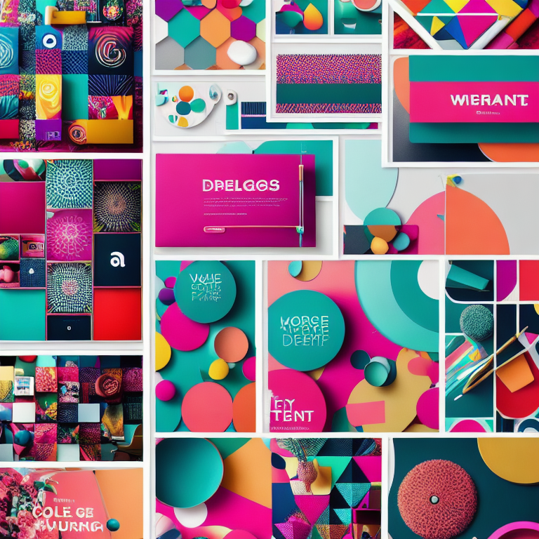
###COLOR CONTRAST MAKES PINS POP
Color plays a crucial role in making your pins noticeable. High contrast combinations like dark text on light backgrounds or bright colors against neutral tones create visual impact. Think about using complementary colors – those opposite each other on the color wheel – to create dynamic, eye-catching designs.
When selecting colors, consider your brand identity and the emotions you want to evoke. Warm colors like red, orange, and yellow create energy and excitement, while cool colors like blue and green convey calmness and trust. Don’t be afraid to use bold, saturated colors that stand out against Pinterest’s predominantly white interface.
Remember that Pinterest is a visual discovery platform, so your color choices should work well when displayed as small thumbnails. Test your designs by viewing them at different sizes to ensure they remain effective and readable when scaled down.
###STRONG TYPOGRAPHY COMMUNICATES VALUE
The text on your pins needs to be clear, readable, and compelling. Choose fonts that are easy to read even at small sizes. Sans-serif fonts like Arial, Helvetica, or Montserrat work well for digital displays. Avoid using too many different fonts – stick to one or two that complement each other.
Make your text large enough to read on mobile devices, which is where most Pinterest users browse. The main message should be immediately understandable without requiring close examination. Use hierarchy to guide the viewer’s eye – make your most important words the largest and boldest.
Consider adding text effects like shadows, outlines, or color overlays to make your words stand out against busy backgrounds. However, keep these effects subtle and professional rather than overwhelming the design.
###COMPOSITE IMAGES TELL BETTER STORIES
Single images can be effective, but combining multiple elements often creates more engaging pins. Try layering text over relevant background images, or create collages that showcase different aspects of your content. This approach gives viewers more context about what they’ll find when they click through.
When using background images, ensure there’s enough contrast between the image and your text. You might need to add a semi-transparent overlay or adjust the image brightness to make your text readable. Stock photos can be great resources, but try to choose images that feel authentic and relevant to your topic.
For a cohesive look, consider creating a consistent style for your pins. This might include using similar color schemes, fonts, or image treatments across all your designs. Consistency helps build brand recognition and makes your content more memorable.
###OPTIMAL PIN SIZES DRIVE ENGAGEMENT
Pinterest recommends using vertical pins with a 2:3 aspect ratio, ideally 1000 x 1500 pixels. This shape takes up more space in the feed and performs better than square or horizontal images. Taller pins can work too, but avoid making them so long that they become overwhelming or get cut off in users’ feeds.
File size matters for loading speed. Keep your images under 10MB to ensure they load quickly across all devices. Use JPG format for photographs and PNG for graphics with text or transparent elements. High-quality images are essential – blurry or pixelated pins reflect poorly on your brand.
Consider creating multiple pin designs for the same content. Different people respond to different visual styles, so having variety can help you reach a broader audience. Test different designs to see which ones generate the most engagement and clicks.
###CALL-TO-ACTION TEXT INCREASES CLICKS
Tell people what to do next by including clear calls-to-action on your pins. Phrases like “Learn More,” “Get the Recipe,” or “Download Now” guide users toward the action you want them to take. Make these CTAs prominent but not overwhelming.
Your call-to-action should align with the content you’re promoting. If you’re sharing a blog post, “Read the Full Article” works well. For products, “Shop Now” or “See Details” might be more appropriate. The key is being specific about what users will get when they click.
Create urgency when appropriate by using time-sensitive language like “Limited Time Offer” or “Only a Few Spots Left.” However, use this tactic sparingly and honestly to maintain trust with your audience.
###DESIGN TOOLS MAKE CREATION EASY
You don’t need expensive software to create great pins. Free tools like Canva offer templates specifically sized for Pinterest, making the design process much simpler. These platforms provide drag-and-drop interfaces, pre-made layouts, and access to millions of stock photos.
Canva’s Pinterest templates can be a great starting point, especially if you’re new to design. You can customize these templates with your own colors, fonts, and images to match your brand. The platform also offers features like background removal and photo editing that can enhance your designs.
For more advanced editing, tools like Adobe Spark or even simple programs like PowerPoint can work well for creating Pinterest graphics. The best tool is the one you’re comfortable using and that helps you create consistent, high-quality designs efficiently.
###FREQUENTLY ASKED QUESTIONS
What size should Pinterest pins be for best results?
Pinterest recommends vertical pins with a 2:3 aspect ratio, ideally 1000 x 1500 pixels. This size performs best in the feed and provides enough space for readable text and clear images.
How many pins should I create for each blog post?
Creating 3-5 different pin designs for each piece of content gives you variety and helps you test what resonates with your audience. Different designs can appeal to different people and perform better on different days or times.
Can I use the same pin design multiple times?
While you can reuse successful designs, creating fresh pins regularly keeps your content feeling current and gives you opportunities to reach new audiences. Pinterest’s algorithm also favors fresh content over repeated pins.
What are the best free tools for creating Pinterest pins?
Canva offers excellent free templates and design tools specifically for Pinterest. Other free options include Adobe Spark, Snappa, and even PowerPoint for basic designs. Many of these tools provide stock photos and design elements to enhance your pins.
How often should I pin to grow my following?
Consistency matters more than volume. Aim to pin several times per week rather than all at once. Spread your pins throughout the day to reach different audiences, and mix your own content with relevant pins from others to build engagement.
Leave a Reply